The Kitchen-Diner, How to Get It right!

23 Jul
Offering a social, family friendly way to live without walls and barriers, the kitchen-diner has become the best example of open-plan living reflecting our modern, informal lifestyles. However, small zones blurring into one large multi-functional space which grows with our needs is not easy to achieve without careful, considered design.
Proceed with Caution
Before embarking on creating this amazing space for all to share, be sure that it is a practical way of living for you. Kitchens are a naturally noisy place, with cutlery and plates and general cooking noises, add in to the mix a TV, children talking and playing and other family members with their activities. This general hubbub can be exacerbated by the reverberation off all the hard surfaces. Life then gets very noisy.
I have been called upon many times when families have moved into homes with established kitchens and then need help to quieten things down. It's all feasible, but as in all our designs it's about taking the time to understand how a family wishes to live and then implementing a design that meets the practical requirements as well as being aesthetically pleasing.
It's all in the planning
Done well, the kitchen-diner can add value to your home and increase the feeling of space - gone are walls and doors and in are larger expanses of floor space. To ensure this room works effectively there are many things to consider such as layout, lighting, zoning, storage, and as mentioned, noise levels. Our advice would be to work with an interior designer alongside the kitchen designer from the initial concept stage as they will bring different considerations to the table. We work with many different kitchen designers but they all have our core values and have the family at the centre of the design. We work collaboratively to look at the design as a liveable whole and not 'we build it, then you can decorate it'. This collaboration brings the very best to clients and avoids costly mistakes. We want your dream kitchen to become a reality and not remain a dream.
" The last thing you want is to remodel your kitchen only to find it less functional or less beautiful than you wanted. Plan ahead of time to make sure this doesn’t happen!" Gary Fullwood, ="" watford="" kitchens="" &="" bathrooms<="" a="" ><="">
="" watford="" kitchens="" &="" bathrooms<="" a="" ><="">
="" watford="" kitchens="" &="" bathrooms<="" a="" ><="">="" watford="" kitchens="" &="" bathrooms<="" a="">
Getting the right layout
Much more than discussing 'where the oven should go' the layout of your open-plan kitchen-diner should take in to account just how you want to use the space. It is important to balance this multifunctional space for the whole family so consider the view positions from the kitchen to short stay seating areas such as breakfast bars where homework may be done or friends will sit to chat whilst you are cooking or to the main dining area, living space or beyond into the garden.
Often classified into five main layouts; one wall, galley, U-shaped, G-shaped, and L-shaped, any layout will work as a kitchen-diner however the removal of partition walls, subject to planning, may be required.
Ensuring that the layout offers ease of movement, designers look to achieve a working triangle between the sink, hob and cooker with as short distances as possible between them.
"The crucial thing to remember when deciding where to put the fridge, kitchen sink and hob is make sure there is no more than 6 feet between each of these items for ease of cooking and movement" Gary Fullwood,
="" watford="" kitchens="" &="" bathrooms<="" a="">
="" watford="" kitchens="" &="" bathrooms<="" a="">
="" watford="" kitchens="" &="" bathrooms<="" a="">
Also consider the distance between the kitchen and the main dining area and those that you pass in-between as no-one wants to carry dirty dishes through
a living space.
Some very sound advice from Carmel Diggins, Halcyon Interiors:
"As it is a vast, multiple usage space it must work for the very young to the elder members of the household. On a day to day basis would this area be used for cooking, living and eating together, and equally important will it be used for frequent large family gatherings? If so, the room would need to encompass a good-sized dining table and entertainment space. Positioning ovens mid height, allows people of all ages to use them and its also futureproofed for when members of the family become elderly"
Islands are often used to help minimise the distances in this triangle and can be utilised for hob, sink and food preparation as well as offering an additional seating area. Level changes for the worktops will help to identify the use and l-shaped ones may be more sociable than having people sitting in a line. An island is also the perfect place to hide sockets (think of installing worktop ones which can be hidden when not in use) and also provide handy prep-side storage areas.

Spending most of your time within an open-plan space you will need to think of how best to reduce noise levels. All white goods emit a range of sounds
think fridge/freeze, dishwasher, cooker and hob - an essential element to the kitchen-diner. Choose your appliances with a thought to their volume
and you will be able to help reduce the overall volume. Reputable manufacturers will be able to provide the decibel reading for each device so as well
as the efficiency rating do take note of these too.
"As development of the design progresses we can adjust sizes of articles and alter layouts accordingly to achieve the greatest impact. In doing this, the balance of space and ergonomic function is achieved in seamless harmony." Carmel Diggins, halcyon="" interiors<="" a="" ><="">
halcyon="" interiors<="" a="" ><="">
halcyon="" interiors<="" a="" ><="">halcyon="" interiors<="" a="">
Sources of Light
Nowhere in the home could lighting be more important and yet more complex! When planning a multifunctional space your lighting must also be up to the job - a one stop shop solution will not suffice. Lights need to be practical in the food prep areas, subtle in the dining areas and adjustable in the living spaces whilst also acknowledging these spaces will be visible when not in use.
There are lots of options to consider such as low-level floor lighting around the base of cabinets, dimmable pendant lights, and even smart lights which keep you fully in control of the mood and colour - read our recent article on the Philips Hue lighting system. The choice may be bewildering however get your lighting correct in the conceptual stages of design and you will not have to retro-fit sockets and wall fittings.

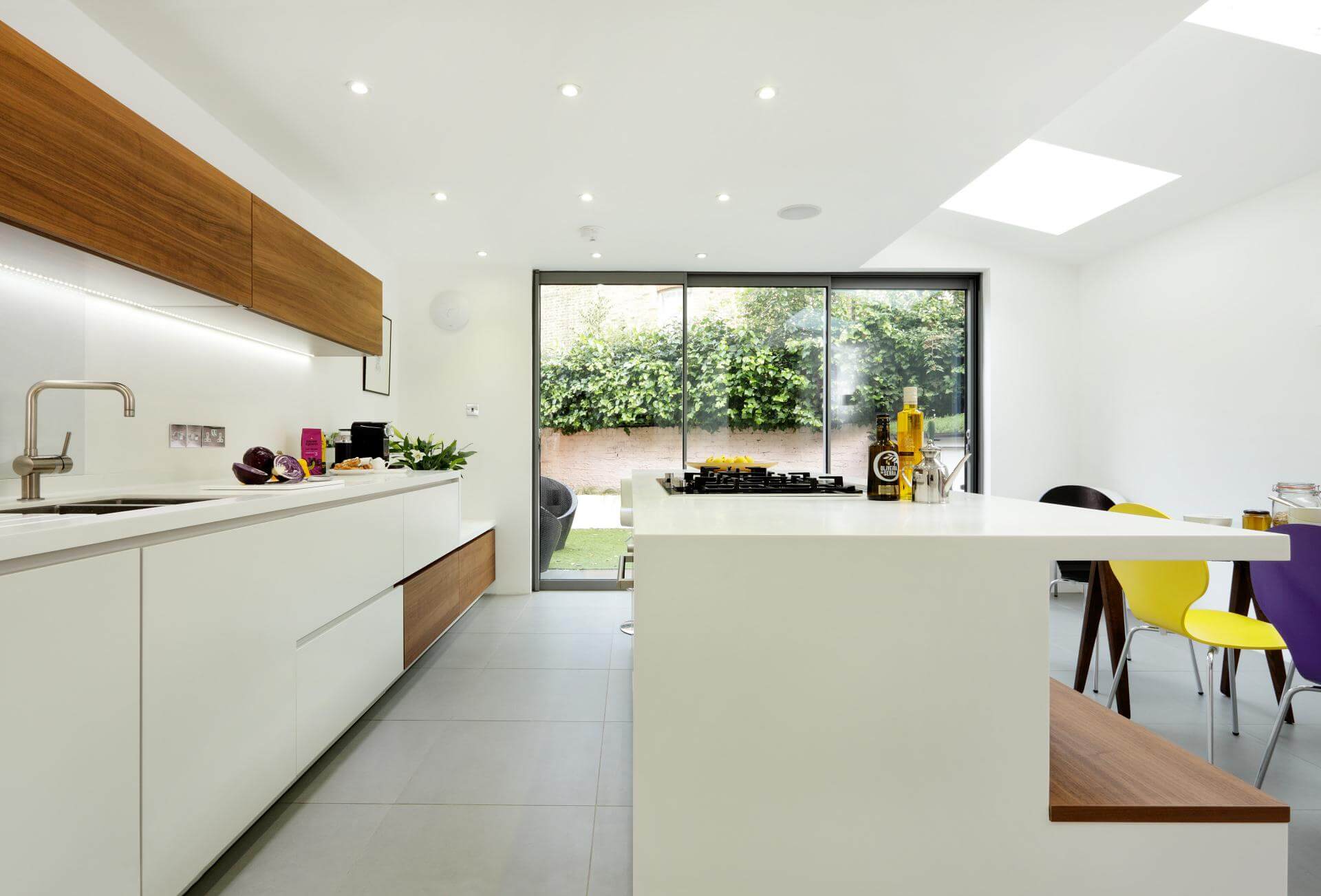
Aim to flood your space with as much natural light as possible. If you are extending your home to accommodate your new kitchen plan for natural light with skylights or large bifold doors to the garden and look to position the kitchen to the rear of the house, linking to your outside space, this will give you the illusion of creating a much larger room. This kitchen, pictured above, by Halcyon Interiors successfully combines under cabinet subtle lighting, functional spot lights in the prep and cooking areas, and natural lights from skylights over the dining table. Furthermore this kitchen can be opened up to the garden through aluminium framed windows extending the space beyond the interior.
Work with your light sources and think of reflective fabrics to increase the brightness or ones which absorb the light to diffuse it. Finishes to cabinets, worktops, wall, tile and floor colours will all be affected by the light so it really is very important to choose your colour palette wisely! For some interiors accents work best rather than large expanses of single colours.
This smaller kitchen by Watford Bathrooms and Kitchens has a high-gloss finish on the cabinets and splash backs with a pop of colour. This, keyed with clever under cabinet, floor-level lighting fills what once felt like a cramped kitchen with light and gives the impression of being much larger. View the project to see the transformation of this kitchen!

A neutral colour palette and gloss tiles are used to great effect in conjunction with under cabinet lighting and functional spotlights in this kitchen by Berkshire Developments to help compensate for the lack of natural light in the kitchen area.

Perfectly demonstrating the creation of an illusion of a larger space, this kitchen by Ben Barnard from Barnard Interiors opens up to the outside, extending the kitchen beyond the confines of the house. By opening the space into the small patio area the two spaces combine beautifully extending both. This trick adds synergy and drama to both and the simplistic planting which can be mirrored internally carries the clean modern lines throughout.

It's all about Zoning!
Your kitchen will naturally have zoned areas - one to prep, to cook, to eat, and to relax and whilst a consistent flooring will tie all these areas together and your lighting will define them think of textures and colours to enhance them.


Here a show kitchen by Halcyon Interiors perfectly demonstrates zoning using bold colours. The wall beside the dining table dramatically contrasts with the sleek kitchen whilst white goods are cleverly hidden in the dark cabinet behind.
Use different floor levels to enhance zoned areas - this is particularly sound advice if you are extending and need to compensate for level changes. And lastly, a simple rug or floor cushion can help to define areas for relaxing from those of dining. As well as defining the function it can also act as a noise buffer.
Call in the Professionals
Along with bathrooms, kitchens are one of the most expensive rooms to plan in your house. Most house purchase decisions are based around the kitchen and bathrooms, so get it right and you will have spent your money wisely for your own enjoyment as well as an investment to ensure an easy sell. Get it wrong and you will be spending more on costly changes or reducing the price when you try to sell.
"With our approach we consider everything from the outset so that no element has to be retro fitted, no building work has to be undone." Karen Chapman, Renaissance Interiors
With our new Design and Build service we will be with you from conception to completion putting you firmly in the centre of your design. Call us to discuss your plans and we will be able to assist you with design concepts, architects and kitchen fitters and together you will achieve the kitchen-diner that fits you, your home and your lifestyle.

